Product

By
Mel Sheppard
//
23 December 2022

Version 1.13 sees a number of improvements to the ways you select and interact with components on the canvas.
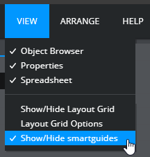
1.13 sees the introduction of Smart Guides which make it easier to align components as they are moved around the canvas.
As a component is moved you will see red lines showing how the its edges and centre lines up with those of other components. As the red lines appear the component being moved temporarily snaps to that position making it easier to drop it in the correct position.
You can toggle smart guides on and off by selecting the menu item at the bottom of the view menu:
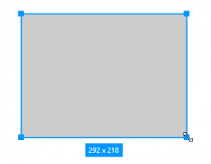
As you re-size a component the size is dynamically displayed at the bottom of the component
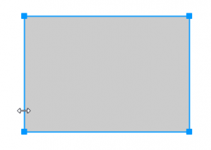
Finally, the selection user interface has been made cleaner by reducing the number of resize handles and allowing components to be resized by clicking anywhere along their edges.
You can now set dynamic visibility on groups. This works in the same way as dynamic visibility on containers and allows you to control visibility on groups of components without needing to set it individually.
We’ve made some significant updates to the charts in Squirrel. They should feel quicker overall (in terms of refresh) and this has enabled us to add several highly requested features.
In previous releases, if you wanted to change from a bar chart to a line chart you had to recreate the chart from scratch. In 1.13 you can switch between many of the chart types without needing to delete and re-add your chart.
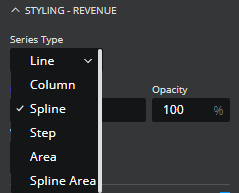
Regardless of whether you start with a column, line, bar, step, spline or combination chart you can easily move to any of the others by changing the type of each of the series independently. This is achieved using the “Series Type” dropdown in the series styling section of the property panel.
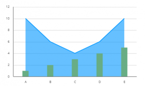
Not only does this mean that switching chart types is possible, but it also allows combinations which were impossible before, for example, bar and area combinations
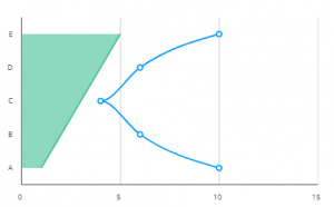
and horizontal layouts for line and area charts.
Bar and column charts now include an option to overlay the bars to produce charts like this.
You can achieve this by checking the “Overlay series” option.
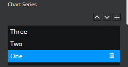
One issue with overlapped bar charts is that the order of the series becomes important. Before 1.13 you would have to delete the series and re-add them in the order you wanted them to be drawn. You can now re-order the existing series.
Re-order the series of a chart using the arrows above the series Listbox by the “add series” button.
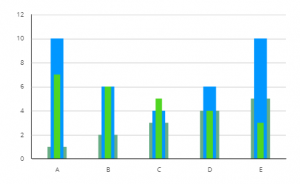
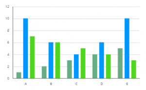
Another new option is to “Group bars”.
Previously all the bars on a bar chart were evenly spaced which could make it hard to quickly pick out which bar belonged to which category.
Now by checking the “Group bars” option the series will cluster together within a category making it much easier to read.
Another requested feature is to be able to add a log scale to a chart. The Logarithmic scale option appears in the X-AXIS or Y-AXIS section of the property panel depending on which one is the value axis.
It is also now possible to start the category axis of a chart where the y-axis intersects. Check the option “Start Categories at Axes Intersection”.
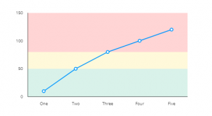
The final new visual option for charts is the ability to add bands along the value axis (either the z-axis or the y-axis depending on the orientation of the chart).
So a chart can have background bands added like this:
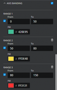
Use the “AXIS BANDING” option and set the appropriate ranges and colours.
For our Business Intelligence/data analyst users, we’ve added 2 new extensions making it easy to augment your existing BI content with Squirrel functionality.
Push Data from Tableau sheets into a Squirrel project embedded within a tableau dashboard.
Publish your Squirrel project as a custom element that can be used in your webi reports and access data from the report data provider.
GET STARTED
Sign up, get building, and pay when you’re ready to launch.