Copywriting is writing with a job to do. Usually, that job is to make the reader think, feel, or act differently from the way they did before. The term "copywriting" is most strongly associated with advertising, but in reality, it's used in all walks of life: from composing a newsletter email to a BI project.
Writing good copy for your BI projects has huge benefits for you and your user:
The key points you want to get across will be easily absorbed.
You can persuade your user to come to a particular conclusion.
Your project will be a pleasurable experience, rather than something that is hard to decipher and understand.
One thing to bear in mind — you can't assume two people will draw the same conclusions from your project, you need to show them the way. So, let's first spend some time thinking about the audience (your users).
It's all about the user!
Understanding your user is the biggest single thing you can do to make the right impact with your copy. You also need to consider the medium you're going to use to reach your users: there's a difference between sending something out via email compared to delivering a presentation in person. You'll need to consider:
Who is/are your user(s)? What do they do? Are they internal/external? Why will they be looking at your BI project? What are their needs? What will they be doing with the project? The point is, you can't effectively achieve what you want to if you don't know what makes your user tick. Creating personas can be a great start.
What do you want your user to do with your project? Be clear on how you want them to act. Consider the tone of your message to ensure the best outcome. The tone needs to be tailored to your specific user, so they feel you understand them.
How will you be perceived? Cluttering up your communications with too much text, crowding text around visuals, not getting to the point, not picking out the right points… could all lead to an unfavourable impression. If you don't get to the point and present a clear and compelling argument, you'll lose credibility and your information might not be trusted.
Does your company have a tone of voice? Do you have brand guidelines to follow? If so, follow them. Consistency is key. It builds trust and you'll be more successful. If you don't have them, create a little checklist of things you want to make sure you do in your project. For example:
Use font: Open Sans. Sizes: 18 for headings, 14 sub-heads, 12 body…
Use bold to highlight key stats/facts.
TOV: Warm, straightforward, and honest.
Terminology: Use "BI" instead of "Business intelligence."
Put CTAs (call-to-actions) upfront, before data/content…
What medium are you using? If you're delivering a presentation words on slides can be kept to a minimum which leaves more room for exciting and explanatory visuals as you talk around what they see. However, emailed communications mean you need to be extra clever and clear with your copy to get your user to understand the points you're making.
How will you get your user's attention? There are three simple things you can do: 1) highlight important stuff, 2) eliminate distractions, and 3) create a clear hierarchy of information.
A badly designed dashboard
A badly designed dashboard
This chart is too cluttered. There's no hierarchy. It's distracting and there are too many fonts.
A well-designed dashboard
Unnecessary detail has been removed. Hierarchy has been considered. Graphics and fonts have been simplified.
Tips for making your copy clear, concise and relevant
A sentence should contain no unnecessary words, a paragraph no unnecessary sentences… This requires not that the writer make all his sentences short, or that he avoid all detail and treat his subjects only in outline, but that every word tell.
Get rid of the noncritical text. Would eliminating it change anything? Does it support your message? If it doesn't add value it becomes clutter and puts a strain on your user's cognitive load. Your message could get lost.
When detail isn't needed summarise! You should be familiar with the detail, but it doesn't mean your audience needs to be.
Create a strong hierarchy. Push necessary but non-message-impacting items to the background. An information hierarchy can help lead your user to form a certain opinion, conclusion, or CTA.
Remember that we read from left to right, diagonally down, then left to right again. Bear this in mind when positioning text. Think about where you want your most important points to go.
5 simple steps to help you design better-looking projects
Tips for annotating charts and graphs
Thoughtful use of text helps ensure your data visualisation is accessible. It has a number of roles when communicating with data: use it to label, introduce, explain, reinforce, highlight, recommend, and tell a story. Words help to make sense of things and sometimes charts don't make much sense without them.
You'll find that certain types of text must be present. For example, every chart needs a title: without a title, the user is forced to stop and question what they're looking at. Time will be wasted, and the message will be harder to understand.
Remember clutter is your enemy! Every element on the page has an impact on the user's cognitive load. If they have to work hard to understand your project, they'll lose interest. It's your job to identify and eliminate non-informative clutter.
Example of a cluttered, ill-thought-out chart:
Example of a decluttered chart:
To keep charts simple you can:
Label data series to save the user from having to go backward and forwards between the legend and the data.
Straighten up text in line with your charts for a cleaner look. Good alignment makes it easier on the eye.
Avoid rotated text: It's not particularly pleasant to read and the only purpose, it seems, is to give you a bad neck!
Use white space or spatial separation: It's as important as a pause in public speaking. It will give your user time to think and take information in. A lack of white space makes for uncomfortable reading.
Remove un-necessary decimal points from your numerical values. They often don't add anything but clutter.
Push non-critical data labels and text to the background: Explanatory text in a muted grey will help the critical text in black (and maybe bold) stand out: it will set a clear hierarchy for the user while reducing cognitive burden.
Annotate important or interesting points directly onto your chart or graph: You can explain nuances in the data, highlight something that needs attention or describe relevant external factors. You'll notice how a few carefully chosen words will make the data so much more accessible.
State the conclusion in words so there's no risk of incorrect interpretation.
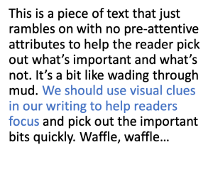
Make use of the Gestalt Principles of Visual Perception: in the early 1900s the Gestalt School of Psychology identified how people perceive order in the world around them. They developed a set of principles (laws) to demonstrate how we naturally look for similarities in things, such as through contrast or grouping. Here is an example of how the use of contrast can help us identify similarities. The second image makes it so much quicker to identify all the number 3's:
Use preattentive attributes (visual clues) to make things stand out such as bold text, size, italics, case and typeface, and colour. Make sure you apply them sparingly to achieve contrast. They'll help you build your information hierarchy by signalling to the user what they should pay attention to next, and so on… The following examples show a piece of text with no pre-attentive attributes, followed by the same text with colour applied, and then again with size:
No preattentive attributes.
With colour applied.
With size applied.
Use storytelling for effective communications
A good story grabs our attention and takes us on a journey, evoking an emotional response. After finishing it we can easily describe it to a friend. I bet that most of us, even though we learned it in our childhood, can still re-tell the story of Little Red Riding Hood.
You can harness the power of storytelling in your BI Project to give it a framework and to engage your user on an emotional level that goes beyond what facts can do.
In his article How to Write with Style, author Kurt Vonnegut outlines some useful tips for storytelling. I've elaborated on a few here:
Find a subject you care about: It stands to reason that if you care about a subject, you'll be more passionate about it and your project will be more compelling because of it. Even if the topic behind your project is not particularly exciting, find a particular angle that you like, see the benefits for your user — get excited by it!
Keep it simple: Hamlet's famous philosophical question, "To be or not to be?" shows how the most simple, childlike questions can be the most profound, and the most remembered.
Have the guts to cut: Be ruthless, think bank to Strunk and White's quote: every word, "must tell."
Be authentic: You need to write and sound like yourself as much as possible. If you sound human and sincere, your user will trust your project.
Pity your reader: In other words, be a sympathetic and patient teacher! You're not writing for yourself; you're writing for your user. Make your user the main character in the story. It will ensure your project is about them and not you and it allows your message to become the pivotal point in the story.
Start with a compelling headline or title for your BI Project
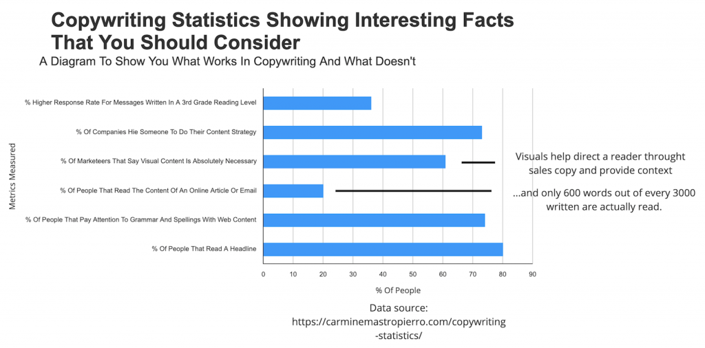
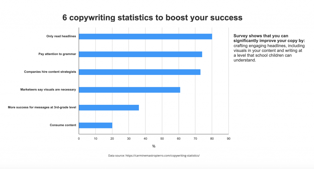
The first thing your user will ask when they see your project is, "what's in it for me?" They will also ask, "why should I pay attention?" Remember that 80% of people will read the headline, but only 20% go on to read the rest. Your headline is important!
Use numbers: The human brain gravitates towards numbers: they're factual, believable, and help to set expectations, e.g. "5 tips for writing better headlines."
Add value: Let the user know how they're going to benefit from reading on. You need to talk in terms of benefits rather than features. For example, a feature of Squirrel is the ability to import a .xlf document. The benefit is the user no longer has to rebuild their dashboard from scratch, saving oodles of time.
Use verbs (doing words): Remember, no floweriness! Consider these two versions of the same heading, "6 helpful ways to be brilliant at content marketing" verses, "6 ways to write better content." I know which one gets my attention!
Play to your user's ego: Involve them in the heading, e.g. "Discover 5 ways you can inspire your team."
Use a question: It creates intrigue and leads the user to believe that the answer will follow.
Make sure your headline reflects the content within. It has to be relevant!
Draft a whole bunch of headlines: Get your ideas down, then go through and cross-ref them against this checklist. Sometimes it's best to brain-dump and let your creative juices flow, otherwise, you'll run the risk of stifling them. Do the tweaking and adjusting afterward.
Come back to your draft headlines later on. Even better, show them to a friend. Get an opinion.
Think beginning, middle, end!
Think about the narrative flow: the order you want your user to experience the story or message. Again, you need to think about who your user is: are they busy? will they appreciate it if you lead with what you want from them? Are they a new audience? Do you need to establish credibility first?
Beginning (intro): tell your audience what you're going to tell them! There's probably a problem you're trying to solve with your BI project. Tell them about it and how you're going to solve it.
Middle: now tell them! Convince them, with the strategies you've learned in this blog.
End (Conclusion): Think CTA! Make it totally clear to your user what you want them to do with the info you've provided. One way to end is to tie your message back to the beginning of the story. You could recap the problem and emphasise the need for action.
Tip: Ask a friend or colleague to check your project. Do they follow the story? Do they understand the message?
Summary
I hope this blog has opened your eyes to the important role that copy can play in your BI projects. By utilising the tips and tricks you've learned, you'll massively increase your project's chance of success in being understood, remembered, and acted upon.
So, to wrap up… half the battle is understanding your user's needs and delivering something you know they'll be interested in. The other half is about clarity and making it easy for them to absorb the message within your project.
Want to understand more about the benefits of good design for your BI projects and what you can do to achieve this? Check out our blog