Expert Opinion

By
Donald MacCormick
//
19 November 2021
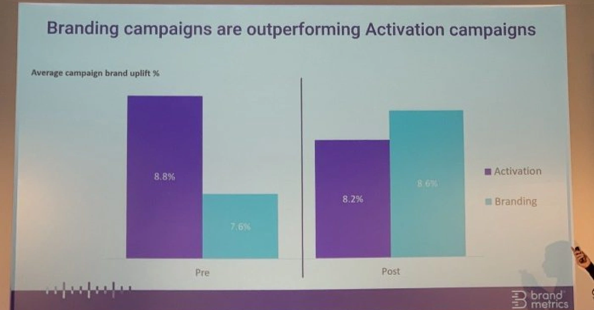
Today Culture of Insight tweeted the picture above of a slide from a presentation they were attending and made the point that the presenter was engaging in the rather dubious practice of y-axis shortening.
This is where the visualization of comparative changes is exaggerated by not starting the y-axis at zero.
This is something which is considered to be very bad visualization practice*.
To see why, play around with the interactive version below. Either by clicking on the “good”, “bad” and “as presented” buttons or by sliding the slider to see the different in overall impression when the Y-axis is not started at zero.
This was created with Squirrel365, if you would like to create content like this direct from your existing spreadsheets sign up for a free account here.
*There are times when not starting your y-axis from zero can make sense (e.g. weather temperature charts) but in pretty much all business contexts the rule of starting from zero should be observed.
GET STARTED
Sign up, get building, and pay when you’re ready to launch.