Design

By
Mich O'loughlin
//
21 September 2020
If you find it difficult to make your dashboard, calculator, or visual application look good, then you aren’t alone. Most people aren’t blessed with a natural eye for design and often fail to spot common design mistakes or know how to fix them.
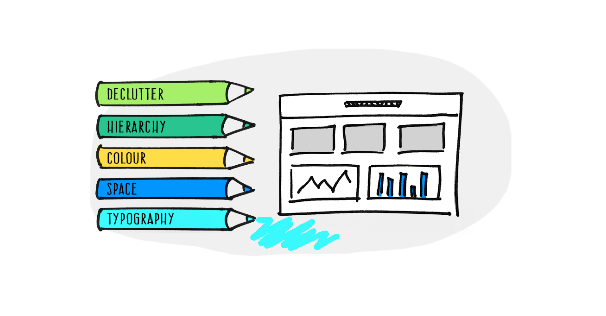
So, we’ve compiled five simple design steps you can take to create better projects. Applying these five best practices will help your project look nicer, be easier to understand for your end-user, and they’ll be more likely to absorb your message and take any relevant action. We hope you find them useful:
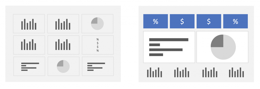
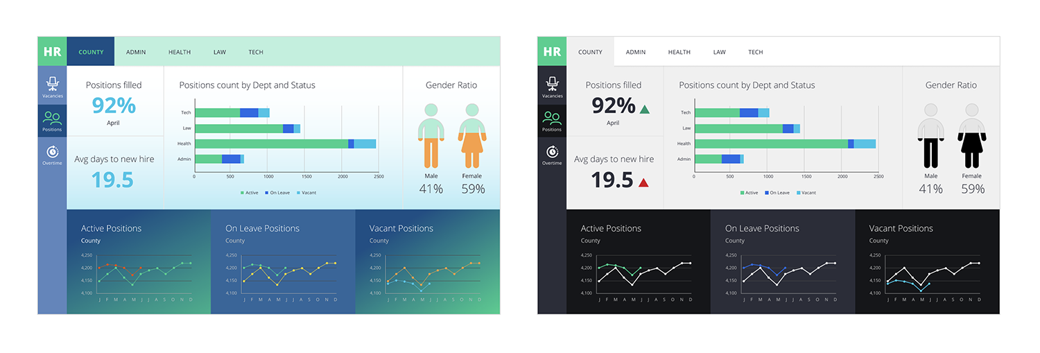
The first and most critical step towards improving your design is to declutter your content. Clutter causes information overload and means the user has to think and work harder to find what they need.
Content clutter could be:
The aim is to reduce the content as much as you can without losing the key insights. This means reviewing all of the information you are currently presenting and identifying content that isn’t directly beneficial to your target audience. If you aren’t sure what your users need, ask them! Find out what is most important and get your users to rank the rest of the information by priority order.
By reducing and refining your content, it enables you to create a more focussed design that will serve the needs of your users better.
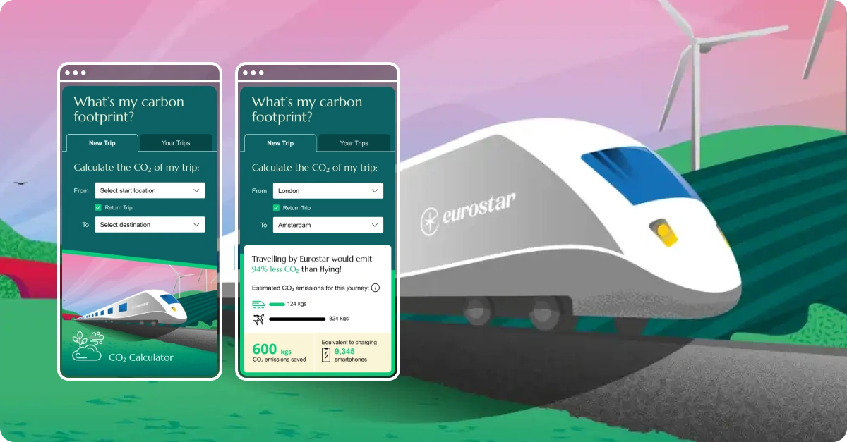
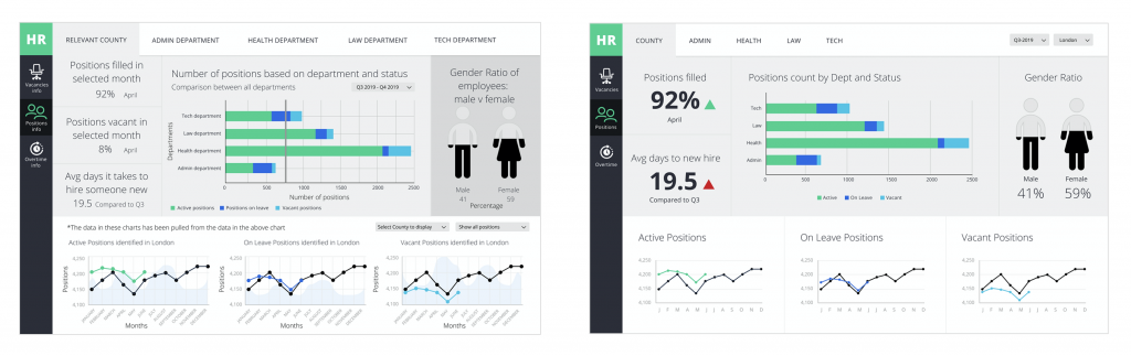
Here’s an example of decluttering:
Visual Hierarchy is about ensuring that the most important information stands out and the less important information doesn’t distract. Having this hierarchy is very important: it helps guide users through your content and delivers the information to them in a logical way. Get this wrong and your user’s eye will be drawn to the wrong thing first.
When starting your design it helps to know what information is most important to your users, what is secondary information, and so on. Identifying these priorities will help you apply the appropriate visual treatment to the content and give it the right level of emphasis.
Ways to create a visual hierarchy with your content:
This is the logical place to start when thinking about hierarchy. It’s no surprise to hear that the most important things generally go near the top. But there’s a bit more science to this that we should consider:
In the western world, we read from left to right and zigzag down a page. This applies to the way we ‘read’ on-screen as well. This Z pattern creates four key areas or quadrants where eyes will typically stop and scan the information for longer. Knowing this can help us position our content appropriately. Typically, the top left corner of your design is the best location for your most important content – perhaps the perfect place for the most requested KPI. But the other ‘pause’ points are also good, prominent places for important information.
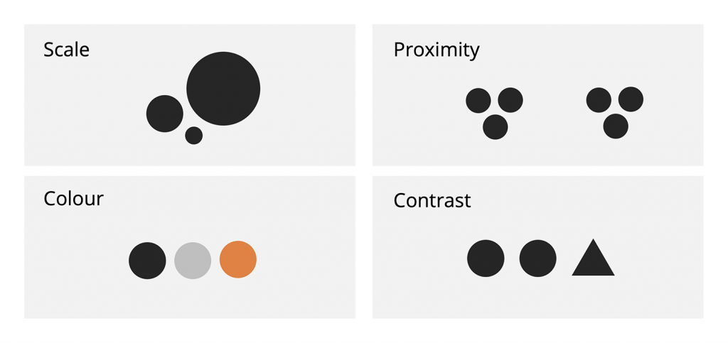
When one item is presented larger than other items our eyes are instantly drawn to it. Scale can be used effectively to emphasise certain content and make it appear more important than other information, and vice versa if you make something smaller.
Items that are placed close together are typically seen as related or grouped, and space between objects helps to define them as unrelated. The way you use space can help users understand the relationship and hierarchy between objects without the need for using borders or boxes to define these groupings.
Applying a bright colour to an element will make it stand out against other neutrally coloured objects.
By making an item look visibly different (in shape, colour, or even making text bold) will help it to stand out. Anything that disrupts a regular pattern will create a contrast and therefore create a hierarchy.
Combining any of these will increase the visual hierarchy even further, but you need to be careful not to overdo it. Otherwise, everything will be shouting for attention and the user will be left feeling overwhelmed.
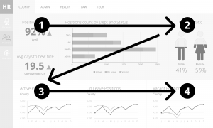
Here’s an example of weak versus strong visual hierarchy:
There are two ways of applying colour to your design — you can use colour decoratively, or you can use colour with purpose.
For dashboard and data visualisation projects, colour with purpose is definitely the right way to go.
Unlike decorative colour (which is just adding colour for the sake of it to make the design look more appealing), using colour with purpose helps to support the information being displayed and gives more meaning to the data. For example, you could use different colour data series’ in a chart, display a RAG status, or simply highlight navigation.
Generally, it’s better to reserve your colours for the data viz, charts and navigation items and keep the rest of the design fairly neutral. If your design is full of colour, whilst it may look fun and exciting, users will have to decipher your use of colour and see through all of the visual noise to get to what they really need – the information.
Decorative colour should be kept to a minimum and must not overpower the meaningful colour on your dashboard.
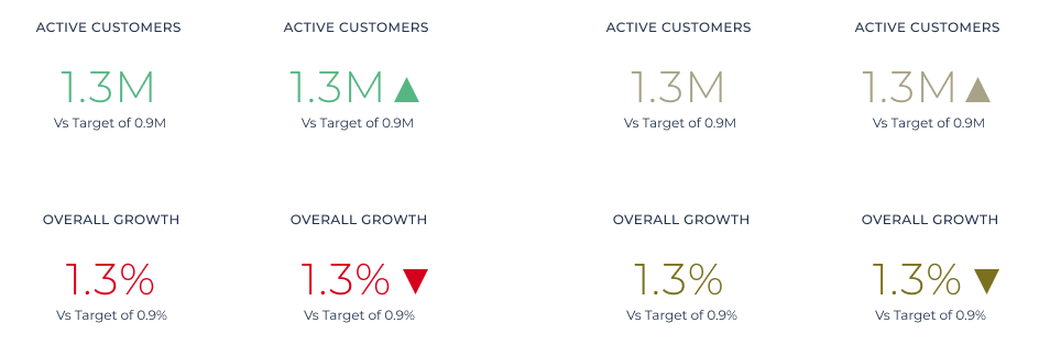
Remember, when using colour (even in a meaningful way), some of your users may have a colour impairment. So be mindful of relying on certain colours: e.g. a red and green status is often indistinguishable to a colour-impaired person. But you can ensure absolute clarity in this instance by using arrows alongside. Combining the shape and direction of the trend arrow with the relevant colour means everyone can understand the meaning even if they can’t determine the colour.
Here is an example of red and green used on a KPI tile:
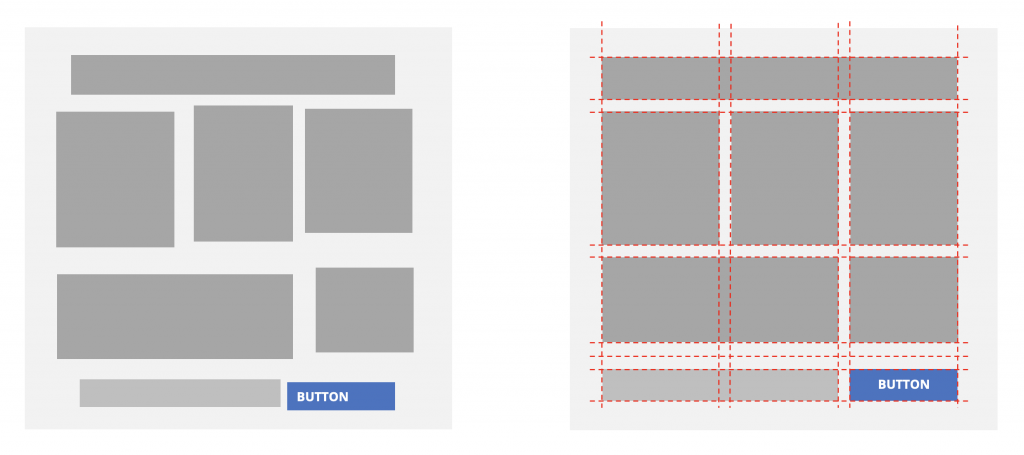
This one is quite simple. You should line things up and add in some white space – if you don’t your design will look messy and unprofessional. This could put the overall quality of your project in question. Lining stuff up is actually really easy to do.
In Squirrel we have tools available to help you:
Here’s an example of alignment:
‘White space’ (or negative/unused space) is something that often gets compromised in designs – particularly dashboards, usually due to the large amount of information being presented on one screen. But with a good declutter of content (as explained above), giving your content some space to breathe will help your design look better, and be easier to use.
Don’t be afraid of white space. It’s as essential to a design as the content itself.
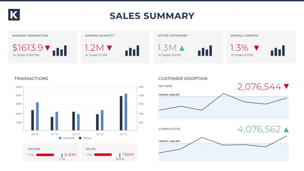
Here’s an example of a spacious dashboard:
Good typography can be the difference between a good design and a great design. But choosing and using a font effectively can be daunting to many people.
If your client has a brand font, use it. It will reinforce their brand identity and means one less thing for you to think about. Firstly, check its legibility; particularly at small sizes as it may have been selected a long time ago for print based projects. If it’s not very legible then you should consider selecting a different font for the project.
Generally, Sans-serif fonts are considered more legible on screen – as they work particularly well at small sizes. Their simple and open letterforms are suited to on screen designs displaying numbers. Decorative or creative fonts should be avoided; their elaborate design can become distracting and are often hard to read.
Bear in mind which tool you’re using to create your project. Some tools have limited font options and some tools allow you to upload your own font to use. Have a look at Google Fonts (link) – this is a fantastic resource of well designed, free fonts that you can use in your projects. It’s also categorised, with descriptions of the fonts making it easier to select the kind of font that might suit your project.
Most fonts have multiple weights available ranging from Light all the way up to Extra Bold. It’s worth playing around with the different weights at different sizes until you find the optimal combination. Don’t overdo your use of different font weights – try to stick to two different weights e.g. Regular and Bold. Pick weights that contrast each other nicely so that you can use them to create emphasis where needed in your design.
Creating a clear and consistent typographic hierarchy is a useful thing to do at the beginning of a project. This involves deciding what font size and weight you want for each ‘text’ type, such as the Main title, Subtitle, Body text, Axis label, Micro copy etc. Avoid having text styles that are almost the same size, e.g. 15 and 16px as even the difference is negligible it can make the design feel untidy.
Here’s an example of a simple typographic hierarchy:
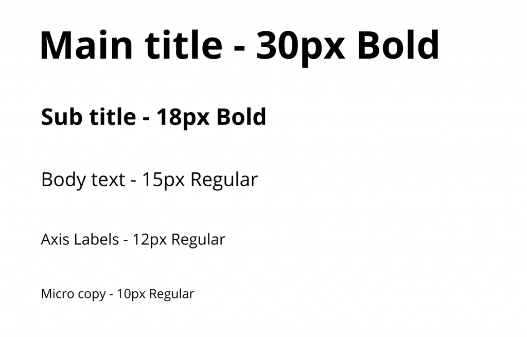
Once you have this, you can ensure the text on every screen in your project remains consistent and looks more professional.
We hope these five steps help you with the design of your next project. And if you want to learn how you can write good copy for your project, we share some more best practices in our blog Improving the user experience with copy.
GET STARTED
Sign up, get building, and pay when you’re ready to launch.