Expert Opinion

By
Claire Harris
//
13 May 2021
Ever wondered how you can work faster in Excel to become more productive? Looking for some essential Excel tips?
Organising your data, and making it easier for decisions to be made from your spreadsheet is not as hard as you might think.
John Michaloudis — MyExcelOnline, and Donald MacCormick — Squirrel365, say there are two things you can do to ensure your data is presented in the best possible light for easy analysis:
There are over 750 million users of Microsoft Excel but how many of them know how to get the most out of the tool and take their Excel skills to the next level? And how many of them have the ability to turn their data into visual, easily consumable insights where the end-user has control over what they see?
In an eye-opening webinar John Michaloudis — Chief Inspirational Officer of MyExcelOnline joins Squirrel365 to share his favourite 10 tips from his book 101 Best Excel Tips and Tricks.
This blog provides a summarised version of the first 5 tips (read up on tips 6-10 in part two) and reveals how you can go on to build interactive content with your Excel skills. You’ll quickly learn how to supercharge your Excel spreadsheets and save time in the process. Let’s get stuck in.
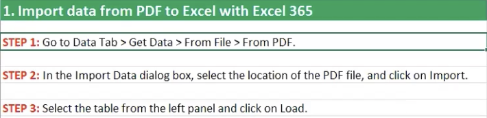
Historically, it hasn’t been easy to bring your PDF content into Excel. Older versions require a copy and paste method or the use of an add-in. But the latest version (the subscription version) lets you easily import PDF content from the Get Data & Transform area in the Data menu.
Once you’ve imported your file you can view what’s in your PDF file.
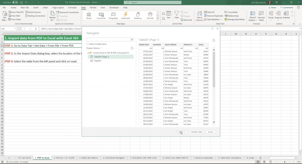
When you’ve checked you have the right file, just press Load, and the data will be put into a new sheet in Excel.
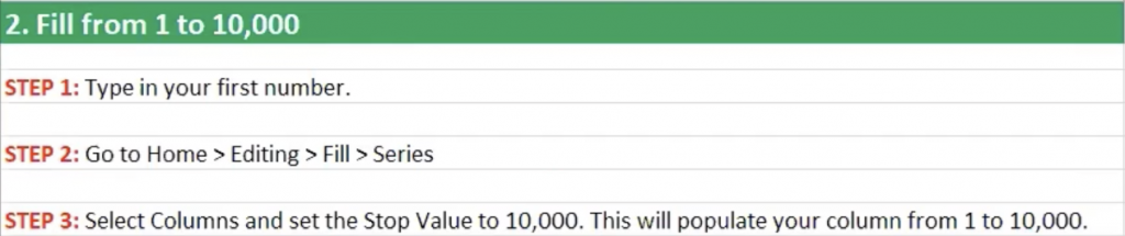
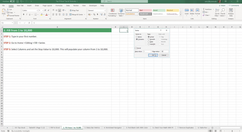
This essential Excel tip is a real time-saver. It’s much quicker than manually filling in hundreds or thousands of rows with numbers. Simply choose your preferences and select OK.
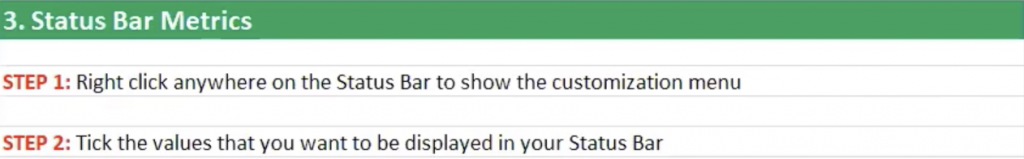
The Status Bar is the light grey area at the very bottom of Excel, below your tabs/sheets. If you right-click in that space you’ll see a box where you can customise what is shown in your status bar.
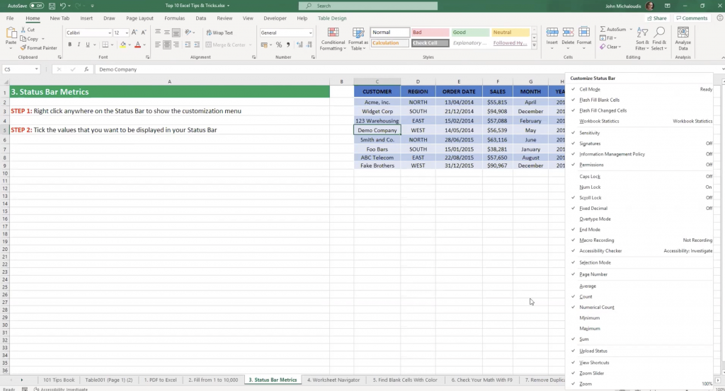
Customising your status bar means you can change what you see below the tabs/sheets. For example, you can choose to show the Average for your selected cells. It’s a great alternative to doing using formulas and it’s much quicker.
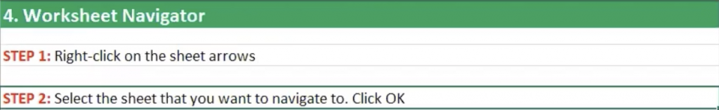
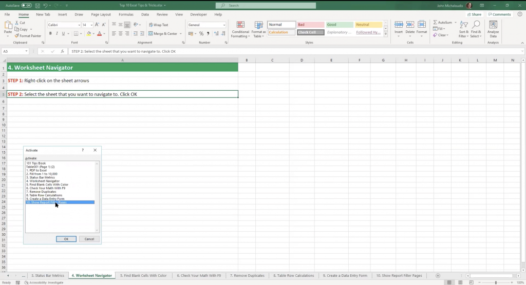
If you’re working with a spreadsheet with lots of sheets, you’ll find yourself doing a lot of scrolling through tabs at the bottom. But, if you right-click in the little arrow box at the bottom on the left, an Activate box will pop up and you can see a list of all your sheets.
It’s much easier to select the required sheet from here.
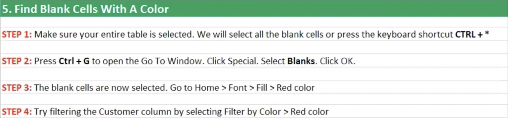
If you have a data set with blank cells it’s good practice to fill these in to avoid any confusion. The good news is there’s an easier way than scrolling through all your data to find your blank cells. Simply use the Special option from the Go To Window.
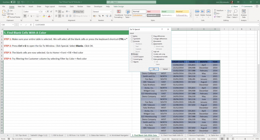
Selecting Blanks highlights the blanks in your data set. With blanks highlighted, you can fill them with a colour. Now it’s a matter of adding a filter so you can filter by colour and for specific columns.
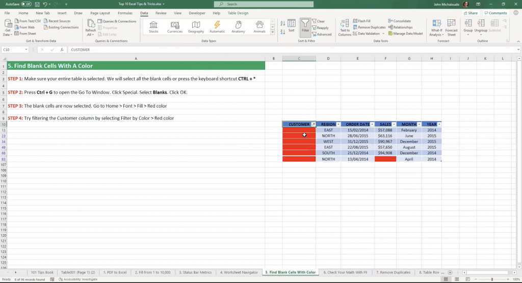
You can now quickly fill in the blank cells with relevant text without having to manually scroll.
For more time-saving tips read 5 Essential Excel tips from John Michaloudis part two. Or you can watch the on-demand webinar where John walks you through all of his essential hints and tips.
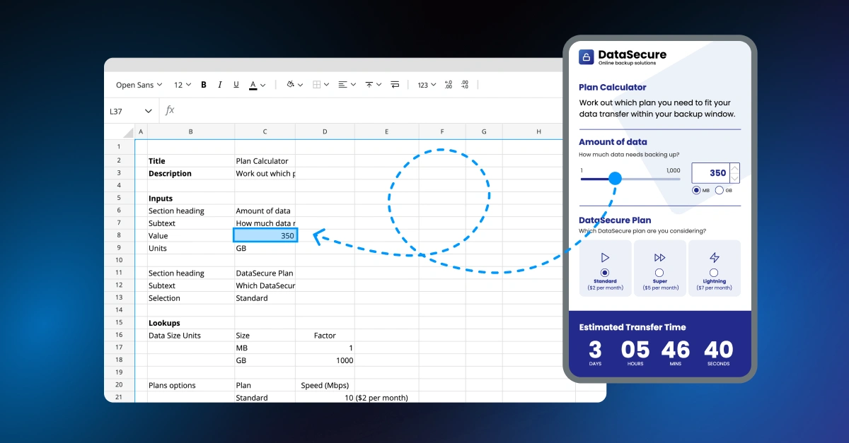
John advocates using Excel in conjunction with Squirrel365. Squirrel opens up a world of possibilities, enabling you to build interactive content with your Excel skills.
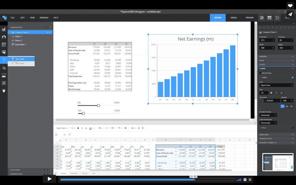
John has a financial model spreadsheet (from a MyExcelOnline financial modeling course) with various tabs for income, expense, drivers, KPIs… When he makes a change to the drivers sheet, for example, to update the amount of revenue, Excel updates the other sheets.
All good so far, but the frustration comes with the need to check the updates because it requires a bit of back-and-forth which can be slow work.
With Squirrel365 you can take your data and create an interactive dashboard.
John says:
You can create things in Squirrel without a need for advanced Excel skills (which you would need if you were creating it in Excel). In very little time you can produce interactive web content or a dashboard with all your data. And you can do things such as change the revenue and see what happens to the rest of your data.
Squirrel removes the need to scroll between different sheets in Excel and it’s great for doing forecasting budgets. You can improve the usability of a financial model spreadsheet by turning it into an interactive model which is much easier to use and understand.
You can use the sliders to change your revenue and other markers, and see the results on the graph and in the table and KPIs. And you can build your interactive content for PowerPoint or for the web.
It’s easy to create calculators, dashboards, interactive visualisations, and web apps in Squirrel based purely on the Excel capabilities of spreadsheets like John’s. Visit the Squirrel Showcase to fire up your imagination and see what else you can build in Squirrel.
There is a wide range of how-to videos to get you started in Squirrel, but it all starts with importing your xlsx file.
With Squirrel, you don’t leave Excel behind, you bring it with you, leveraging your existing knowledge. You can make changes to your data and formulas as you go which you can then export back out so you have the latest version.
Once you’ve imported your spreadsheet it’s a matter of dragging and dropping components (charts, diagrams…) onto the canvas, customising them, and binding them to your data.
Once your data is in a chart, remarkable things can happen.
If you add a slider to your canvas, and bind it to a spreadsheet driver such as revenue growth, when you slide the slider back and forth to change the revenue it changes the output in the chart — you just bind the component to the spreadsheet logic to see the different outputs. It’s as simple as that.
You can custom format all of your charts and components and do things like bind your text in a Text Label to a colour specified in a cell in your spreadsheet.
Or you can set a KPI to change colour depending on the formula you’ve given to your data. For example, you can tell Squirrel to make the KPI red if the user moves a slider to a numeric value below a certain percentage, or green if above it.
All this dynamic interactivity comes directly from the data in your spreadsheet.
Publishing your projects up to the cloud is easy with Squirrel’s Project manager. And it’s immediately available to embed into PowerPoint or share as a web link.
The Squirrel add-in for PowerPoint lets you take the project ID from Squirrel, put it into PowerPoint, and then interact with the project as you would in Squirrel. So you can share the link, embed in Teams, or put it on your website. There is an enormous amount of capability in terms of what you can create and how you share it.
GET STARTED
Sign up, get building, and pay when you’re ready to launch.